Bad Color Ideas for A Commercial Space
Modern research has begun to discover how different colors affect human behavior. While not all findings are conclusive, psychologists seem to think certain colors are linked to productivity and overall mood. Of course, these findings are general and research is ongoing. Some individuals might react to a color differently than others. Still, there are some shades and colors that seem to yield negative results on most people in the workplace. If you’re ready to hire commercial painting contractors, here are some colors you should avoid for your commercial space.
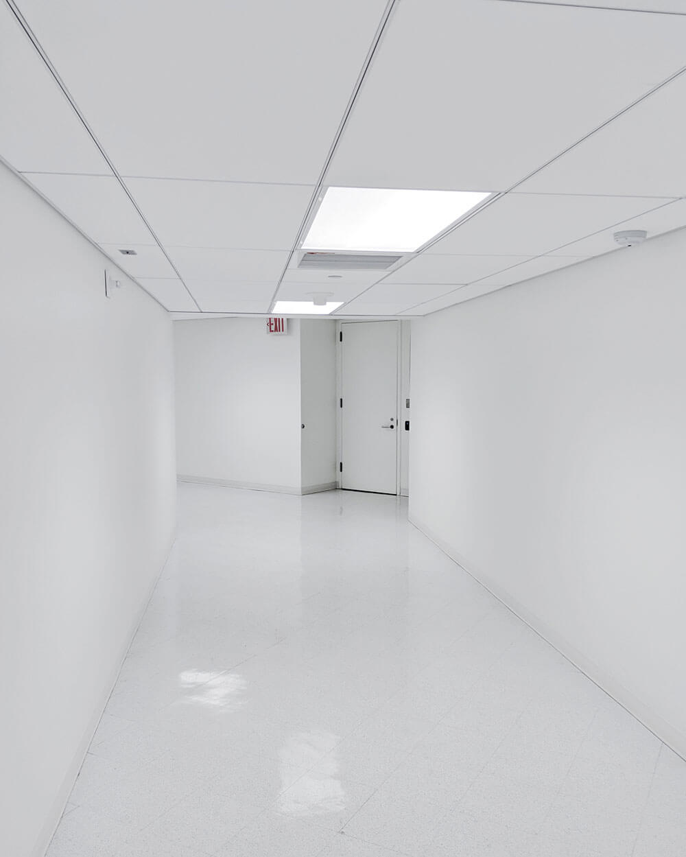
White
Interestingly enough, white is probably the first shade that comes to mind when imagining an office setting. Indeed, many commercial spaces do feature white walls, but probably to their detriment. White, while seemingly pure and innocuous, quickly becomes sterile. A white room might feel more spacious, yes, but also more empty. Not to mention, dirt, scuffs, and scratches are more noticeable on white surfaces. Employees and customers alike are bound to eventually take notice of the room’s flaws. Instead of white, ask your painting services to work with something a bit livelier. Consider bright greens, blues, or oranges.
Gray
Gray shades, while not as empty as white, still exude an uninviting coldness. There is something industrial and inhuman about grays, especially on the darker end of the spectrum. Seasonal depression is also common in colder, rainier regions when the sky is mostly gray. If you want your staff to feel energized and awake, avoid these shades at all costs.
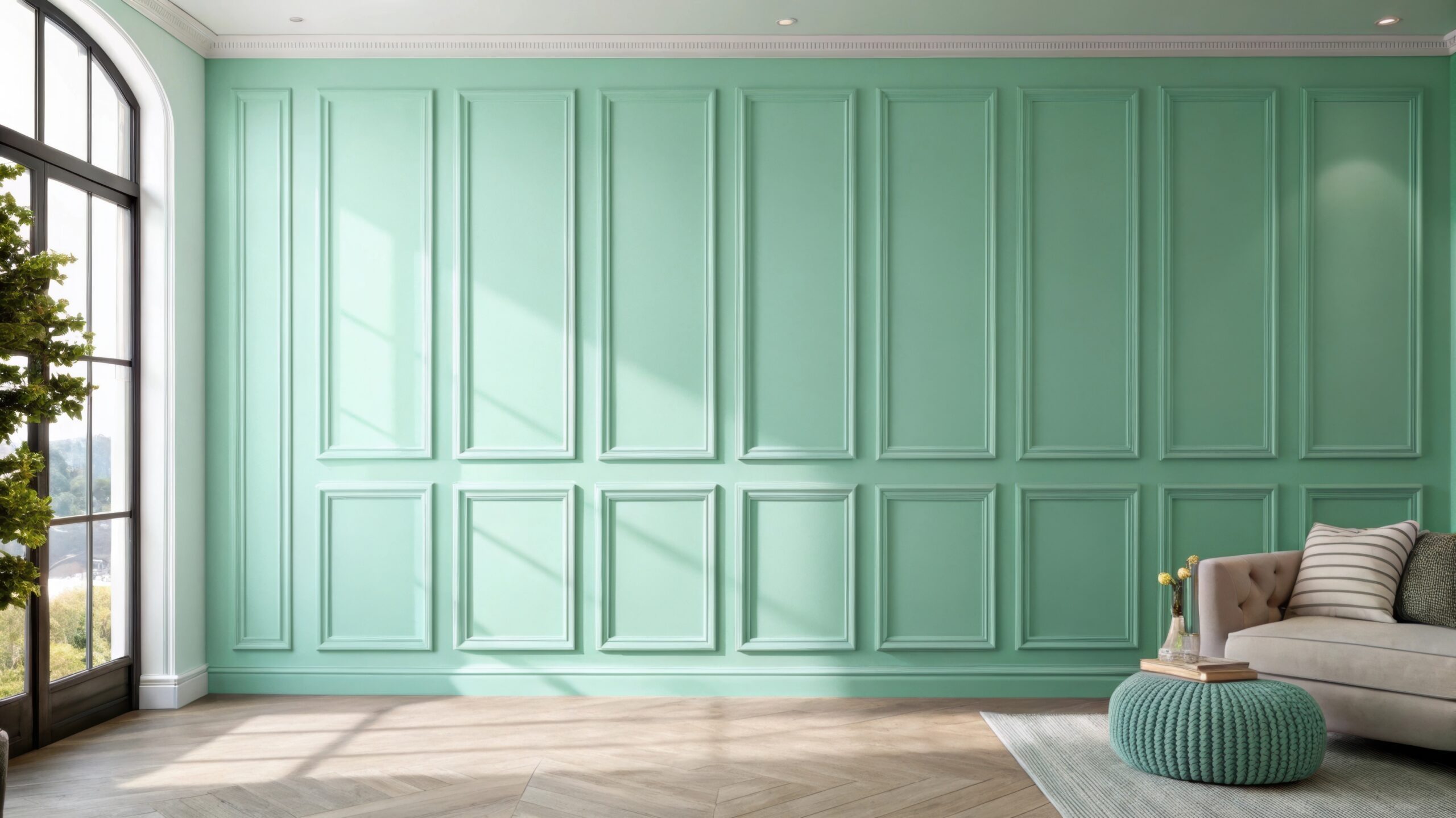
Pink
Shades of pink can actually be quite energizing and inspiring for some. The color of bubblegum, cotton candy, and spring flowers, pink often reminds us of childhood fun and innocence. However, for interior painting, too much pink can be a bad thing. This color can actually become distracting when exposed to it for too long. The eye needs a break from the sickly sweet color after a while. If a commercial space is mostly pink, it might actually decrease mood and productivity.
Anything Too Dark
It’s true that dark colors can be quite relaxing and atmospheric, especially in a home. However, darker shades can become counterproductive in a work setting. Our bodies naturally associate darker colors with winding down for sleep. If a commercial space is too dark, employees will lose energy and possibly take a nap on the job. Offices that encourage naps during the day can designate a room with darker walls for these purposes. But in general, you want your commercial painting job to be bold and bright so everyone stays alert, creative, and productive.
If you’re not sure about which color or colors to paint your office, consult your painting service beforehand. They may be able to help you choose the right colors and even show you examples of their previous work so you can get an idea of the finished product. At All American Painting Plus, Inc., we work hard to meet our clients’ commercial painting needs. We’ve been helping homeowners and business owners transform their spaces for over 25 years. Give us a call at 703-620-5563, or email us at info@aapplus.com for an estimate!